Bubble Chart Creator
Quickly and easily create bubble charts from data tables.
An add-in for Microsoft Excel that creates sensitivity, tornado, and fishbone charts.
The Sensitivity Chart Creator is an add-in for Microsoft Excel that creates sensitivity charts. It is compatible with Microsoft Excel 2013-2024 and Office 365.
The following sensitivity chart was created by the Sensitivity Chart Creator:
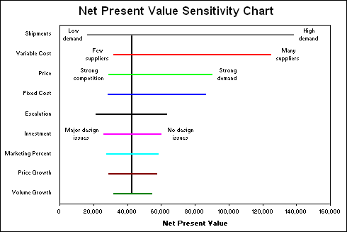
These charts are also known as tornado or fishbone charts due to their appearance. They show the sensitivity of key output variables — in this case Net Present Value — to key input cells (shipments, variable cost, volume growth).
Quickly and easily create bubble charts from data tables.
Create cascade charts that help you explain your data.
Do goal seek on multiple cells automatically.
Do decision and risk analysis the easy way.
Do numerous "what if" and sensitivity analysis cases in seconds.