Cascade Chart Creator
Create cascade charts that help you explain your data.
An add-in for Microsoft Excel that makes it easy to create bubble charts.
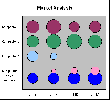
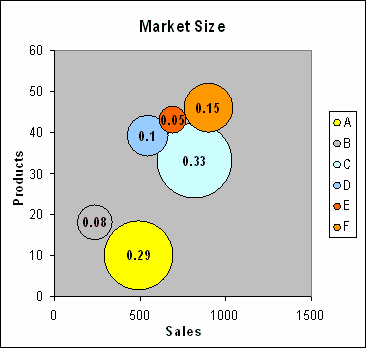
The Bubble Chart Creator add-in for Microsoft Excel makes it easy to create bubble charts, especially bubble charts from tables of data. It is compatible with Microsoft Excel 2010-2021 and Office 365.
The Bubble Chart Creator can easily create bubble charts from tables of values. It can also handle negative values, and it can create charts that show three different dimensions of values — for example, market size by year by competitor — without a confusing set of lines or columns to study.
It can also create classical bubble charts and gives you many options, such as coloring each bubble differently to add a fourth dimension, and using date values for either the X or Y axis.
A great time-saving feature is the ability to create many scatter-type bubble charts at once. You can easily create 10, 20, 40, or more bubble charts with just a few clicks.
Create cascade charts that help you explain your data.
Create charts that show three dimensions of data.
Easily create sensitivity or tornado charts.
Create charts that compare quantity or volume to unit rates such as price/unit.