Bubble Chart Creator
Quickly and easily create bubble charts from data tables.
An add-in for Microsoft Excel that creates variable width and height bar (cascade) charts.
The Cascade Chart Creator add-in for Microsoft Excel allows you to create variable width and height bar charts. It is compatible with Microsoft Excel 2013-2024 and Office 365.
The following is an example of a cascade chart:
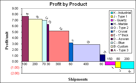
On a cascade chart the X axis represents a variable like units quantity or volume. The Y axis represents a unit rate like profit per unit or a percentage. If one were to multiply the X axis value times the Y axis value one gets a meaningful value. For example, profit per unit times units gives you profit. Thus the area for a data point represents this value.
If you plot profit per unit versus volume for your customers on a cascade chart then the shape of the data point's rectangle indicates the profitability of a customer. A tall, positive box indicates a very profitable customer. A short box with a long base indicates a customer who you are shipping a lot of product to who gives you very little profit.
The Cascade Chart Creator can also create stacked cascade charts:
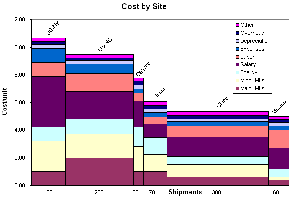
To help you learn how to create cascade charts, the Cascade Chart Creator comes with an example file with sample data and step by step instructions.
Quickly and easily create bubble charts from data tables.
Create waterfall charts that help you explain changes in performance.
Create charts that show three dimensions of data.
Easily create sensitivity or tornado charts.