Bubble Chart Creator
Quickly and easily create bubble charts from data tables.
An add-in for Microsoft Excel that makes it easy to create dot plots.
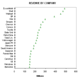
The Dot Plot Creator add-in for Microsoft Excel makes it easy to create dot plots. It is compatible with Microsoft Excel 2010-2021 and Office 365.
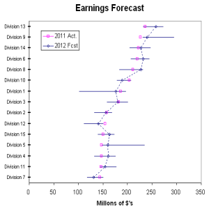
The second chart illustrates plotting two columns of data, with uncertainty bars on the 2012 forecast. Each division has a separate uncertainty range, and the forecast dots have been connected with a dotted line. This makes it easy to see which division is forecasting an increase or decrease in earnings, while the uncertainty lines let you know whether a division is being aggressive or conservative in its forecast.
Quickly and easily create bubble charts from data tables.
Create cascade charts that help you explain your data.
Easily create sensitivity or tornado charts.
Compare quantity or volume to unit rates such as price/unit or profit per unit.